
The write-up below isn't exactly the same as the one found in the Data Sketches book. For the book we've tightened up our wording, added more explanations, extra images, separated out lessons and more.
I have so many things to say and feels to declare for this month, it has been a long and arduous journey. First, I took out the "week 1" part of the header because I started this thing in the last week of August. And it took until second week of December. It's been a long time. Second, my November was Hamilton the musical - not quite a book, unless you count Hamilton the Revolution (aka. the Hamiltome). Third, this Hamilton project is actually a contract for Polygraph, published on their site.
So I want to thank Nadieh and Matt from Polygraph a bucket load, for letting me finish Hamilton as my November data sketch. It helped me loads, because there was no way I was going to be able to finish Hamilton and another data sketch in November, with my travels to Singapore taking up half the month. It also worked out well because I had wanted to do a write-up for all the things I went through for Hamilton anyways, and Nadieh was encouraging of that.
The first thing I did was go through the Hamiltome, and mark any recurring phrases with a corresponding number and note it in my sketchbook:

After that, I had to manually enter all the data. Thankfully, there were already the full set of lyrics online, but I had to go through all the lyrics again to enter the characters, the conversations, and themes in a format that I could use. This whole process took a painstaking three days (and then afterwards Boyfriend wondered if I could have done it in a more automated fashion and I glared at him).


(Raw characters and conversations data)
(Raw themes data)
Now that I had all the raw data, I wanted to join the metadata (characters.csv and themes.csv) with the actual lyrics. At first, I gave each line a key and mapped the data onto that, but after seeing how messy and abundant the small dots were, I decided to group the lines by a consecutive set of lines by a singer.

The code for joining the metadata to the lines can be found in merge.js, and the resulting processed data can be found in src/data (which has a README). The format of the processed data is unfortunately convoluted, since I had to deal with the fact that themes could start in the middle of a set of lines and span several of them.

Once I had the data, I knew I wanted to lay out the lines in a way I could get a sense of who was singing when and for how long. To do that, I thought of two versions of how to depict a line: a circle and a long, narrow bar. To indicate when a line was a recurring phrase, I played around with the idea of a diamond that stretched across lines. And to deal with multiple singers in a line, I thought of overlapping narrower bars on top of each other.
(Looking at the original sketches, I am amazed by how foolishly ambitious I was; to think that I wanted to switch between views grouped by characters, songs, and layed out by song, and then also have filter capabilities in all those views. I was young and naive.)

(The convoluted code for positioning the lines)
The first thing I did when I got back to the computer was to figure out how to lay out the lines by song. Positioning things always always turns out more painful than I give it credit for, and after some bugs and mishaps (math and svg paths) I ended up with the first vertical version, and eventually the horizontal version with the themed diamonds. (That last one has a super subtle bug that took me a while to notice - any Hamilton fans notice it?)
Now if I thought the positioning was bad (that thing only took a few days), the filters were a nightmare. It took me a few weeks on and off to work through all the logic and bugs - I paced around my bedroom and around my living room muttering to myself (the whole freelancing and working by myself thing has had an interesting effect on my social skills). I hadn't felt so frustrated and happy and alive with a piece of code in a long time.

The final logic I ended up with:
(Again, I've no idea why I chose something so convoluted...)
And the interaction that stumped me a bit when filtering: after a certain combination of filters, there are characters, conversations, and themes that can no longer be selected. Take, for example, if we filter by Philip Hamilton (#4 in the above image): notice that some characters, conversations, and themes are missing, denoted only with dotted outlines. This is because Philip doesn't have that many lines, so the songs that he is in (Take a Break, Schuyler Defeated, Stay Alive (Reprise)) don't have many other characters singing. If I allow a user to select any of those characters that don't have a line in those songs, no songs will show up and confuse the user, so after a bit of consideration, I decided to simply disable those users if they no longer appear in the songs.
I worked out four states that a character, conversation, or theme could be in:
(The only difference between this and the final version is that for missing characters, conversations, and themes, I don't show them all together.)
✨✨✨
After I had worked out most of the bugs in the filter, I started to use it to look for insights. At first, I concentrated on the relationship between Hamilton and Burr, but after talking to Taia (my Hamilton expert), she convinced me that there were enough Hamilton-Burr analysis out there and that Eliza and Angelica would be so much more interesting instead. I wholeheartedly agreed.
I filtered by Eliza and Angelica, then by Eliza-Alexander and Angelica-Alexander, and then by their conversations. I then looked at what themes were most commonly associated with all of them. The most awesomely pleasant surprise: I had expected Eliza to most frequently sing "Helpless", but instead, she sang "look around at how lucky we are alive right now" and "that would be enough/what would be enough" far more often. I think that is the point at which I really fell in love with her character, at how optismitic she was, and how much she matures throughout the story.
Here are the notes from my analysis:

And then came a long stretch of writer's block. I went through 3 rounds of rough drafts, none of which I was satisfied with (and none of which anybody will ever see again haha). I knew starting out that I was going to struggle with writing the most - I like to say I'm a horrid writer, but it's really just that I'm a horribly slow writer. I reassured myself that hey - I got the visuals part covered, and though I'm a very slow writer, I'm not a bad writer. How hard could it be to combine those two?
Very very hard. I was naive (again).
It was like a muscle I've never exercised, and though I could do both tasks separately, I had never thought of how to weave both the visuals and the words together. My mind naturally thought of how to code all the visuals (a very well exercised muscle), and it was hard forcing my brain to think of any words. This whole struggle gave me an even bigger respect for data journalists. So much respect.

This was one of my first attempts at laying out the story. From the beginning, I knew I wanted to try to appeal to a wider audience, many that may not be used to the dataviz that I'm used to (a point Elijah also made to me when I showed him my filter tool for feedback). I wanted to ease them in slowly to get them used to all the different layouts and the concept of my filter tool, so I originally had a lot of introduction planned. I also knew that it'd be a long article, and so wanted to delight the viewer to stick around (an important lesson I learned from Tony's Animation, Pacing, and Exposition). To do that, I used D3's new force layout to position the dots, and then have them explode out, and then zoom back together. It's a (cheap but) fun effect, and did indeed seem to delight when I showed it to a few people at d3.unconf:

At this point after the intro sections, I was stuck. I didn't know how I wanted to get to the meat of my analysis, and it languished for most of October as I worked on other projects.
✨✨✨

I got back to Hamilton on Election Day, right after finishing my October data sketches and write-up. The break from Hamilton was especially helpful to clear up my head, and I went back to my notebook to figure out how I wanted to convey my analysis and insights.
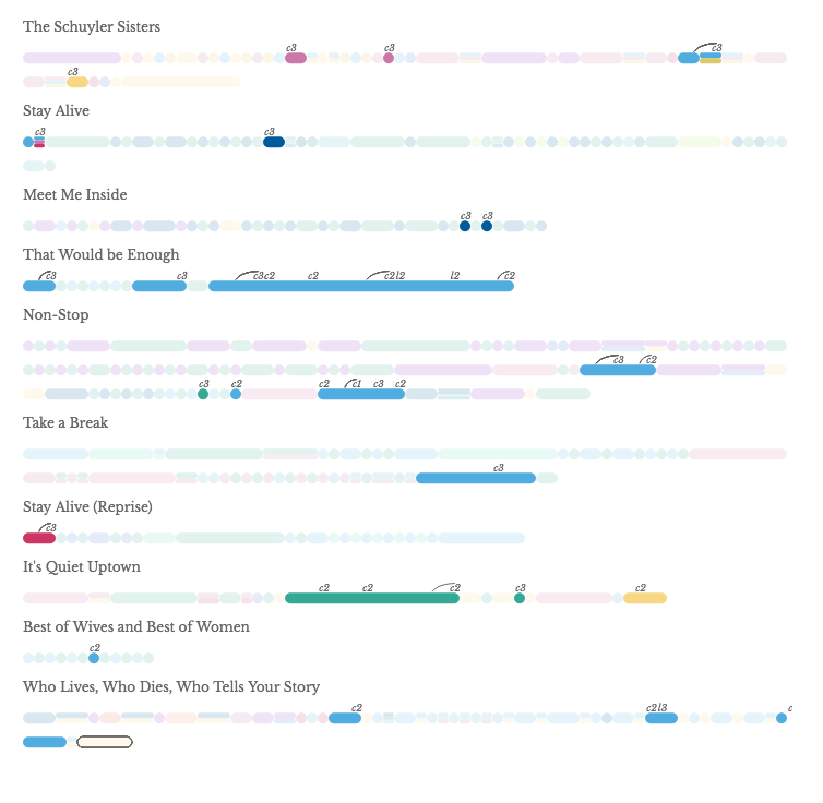
The biggest breakthrough for me in this sketch was how to convey the themes, which I was struggling with; the diamonds were good to point out where the recurring phrases were, but it made the visual too cluttered especially with all the colors I had to use to distinguish them (which also added to the confusion, because I was already using colors to identify characters). This version of an arc and then a label (first letter of theme and a number) appealed to me not only because it was so much simpler and used no color, but because it also looked like the notations on a music sheet. To add to the reference further, I wanted to also have the musical staff, which could help indicate length of the lines:

Each section indicates 10 lines, with 70 lines across. I quite liked the effect, but it also looked cluttered and created confusion when I showed it to a few people. I had to agree that removing the staff was for the better, but kept the themes as the arcs looked so much cleaner than the diamonds:
With the visual part of the analysis figured out, the outline came much easier, and I managed to finish most of my final draft on my flight to Singapore (17...hours...never...again...):

✨✨✨
When I was almost to the finish line, I showed Sarah Drasner (who I got to meet at JSConf Asia and she was such an awesome individual) for feedback on the animation, and her immediate reaction was, "Canvas! You need Canvas." At ~1700 path elements, SVG was doing alright. But on scroll, you could start to see the lag in update.
So I started on converting all the SVG to Canvas. And as Kai always says, when Canvas breaks, it breaks in the most wonderful way; my very first attempt, it broke and made very Jackson Pollock art (be patient with the gif, it's large and may take a bit to load):

Once I got Canvas rendering everything as it did before, the performance was indeed so much better. The next step was to add in the interaction with hidden Canvas (if you're not familiar, Nadieh has a great explanation here):

This is where I encountered the most frustrating bug I've had in a while. I would hover over a line, and though the Canvas and hidden Canvas were clearly positioned at the same x and y, the tooltip would react incorrectly:

It took me hours of agony to realize that, because I had scaled both of the canvases by 2x to make sure Canvas would display crisply on retina, the underlying Canvas image data was also scaled by 2x. But I was getting the x- and y-positions and instead of multiplying those numbers by 2, was directly querying for the data. Which is why when I hovered, the tooltips that popped up were all at about half the x and y-positions of where I was truly hovering.
Once I had that figured out, everything was relatively smooth after. I made final edits to my content, fixed some more positioning bugs with the tooltip, and spent another agonizing day making everything mobile-friendly. (Making things mobile-friendly is always emotionally draining for me.) One of my favorite final things I did, was to highlight the corresponding song that I mention in the analysis as user scrolls:

And one more Canvas broke and made beautiful art:

Here's the (filter tool) I ended up with. Click on the gif to read and explore:

Hamilton has been a journey. While working on the project, I also designed and coded the first version of my portfolio website, partially designed the data sketch|es website, helped organize d3.unconf, finished August, September, and October data sketches, went to Singapore for JSConf Asia, and worked on two other contracts (one of which was a visualization of viewer response to the second presidential debate, which I thoroughly enjoyed). It was hard and I got stuck quite a few times, but I'm so glad to have the experience and am ridiculously happy with how it turned out.
In the summer of 2016, I got really, really obsessed with Hamilton: An American Musical. It was quite a unique experience because all of the show’s lines and dialogues were contained in songs, so I could get the whole plot by listening to the entire cast recording. I had it on repeat for months, and it got to a point where I was analyzing lyrics and searching for recurring themes throughout the musical. At one point, my boyfriend (now husband) suggested I turn it into a data visualization. I was really resistant at first (“that’s beyond obsessive!”), but eventually gave in (“ok I guess I am that obsessive.”) I had been talking to Matt Daniels from The Pudding—a collective of journalist-engineers that work on visual essays—about working on a story together, and pitched the idea to them. I wanted to create a visual tool to analyze character relationships, recurring phrases, and how they evolved throughout the musical—and they agreed.
I had originally budgeted one month to work on the project, but it ended up taking three months on and off. It took so much time and was so all-encompassing that I didn’t have the time to work on a project for the “Books” topic, and I asked Nadieh if I could turn my Hamilton visualization into a Data Sketches project. It was a musical, but I made the point that I had created the dataset using Hamilton: The Revolution (a detailed book about the creation of the musical, lovingly referred to as the “Hamiltome” and co-written by Lin-Manuel Miranda, the creator of Hamilton) and Nadieh thankfully agreed (;・∀ ・)و


